
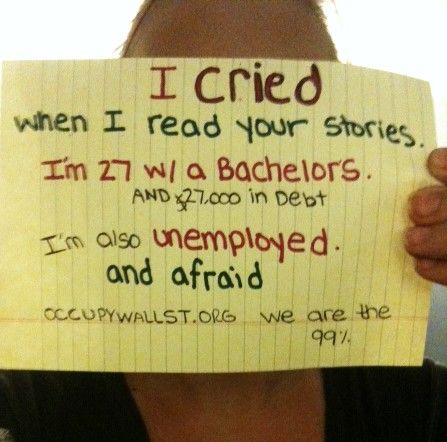

wearethe99percent.tumblr.come
I’ve been inundated with tweets, updates, e-campaigns and news clips that ‘take sides’ over the unfolding of OccupyWallStreet. A major complaint from those dismissing the actions of ‘The 99%’ is that the ‘#occupy’ crowds are leaderless and unfocussed. Fear-mongers have stated with confidence that this type of thing leads to totalitarianism. Jon Stewart has had a field day with those folks.
But maybe all of us are missing the real point.
Lately I have been facilitating a ‘Demonstrating Value’ project with a local organization, and helping them figure out how to effectively show the impact of their existence to different internal and external audiences. Like most community-based groups that work directly with the spectrum of local residents to engage, support, and empower them to connect and build healthy neighbourhoods, the work itself takes precedence, and any time consumed in data-gathering and reporting, as requested by their funders, is time lost to service.
The result is that the numbers game of dispassionate statistical ‘information’ leaves little room for creativity in demonstrating the impact of the organization’s work on the lives of real people in the immediate and long run. Let alone room to find ways to take this information beyond the local and ‘social feel-good’ of traditional philanthropy and effectively prove their economic and social importance to the community at large. And so, as I have worked through these issues at the local level, I’ve seen a pretty effective example being built in New York and beyond.
There is rarely a simple way to illustrate complex issues to a diverse audience. One person’s story, no matter how representative, is not enough. At best, this can lead to a band-aid solution for a special case. At worse, denunciation of the story and dismissal of the person as a liar.
Lately, we’ve seen the increased use of visual communication to illustrate, explain, persuade, elaborate and engage in very effective – and often amusing or poignant – ways. When done well, data visualization and infographics help us conceptualize complex ideas. They tend to ‘go viral’ and generate discussion online. It’s really a new riff on a longstanding tool: from cave paintings to the AIDS quilt, we’ve found ways to share concepts visually.
#OccupyWallStreet (including the online images of #wearethe99percent) is a living version of such a thing. It raises awareness of the impact of what’s happened on all sorts of citizens and can help us gain momentum for the major reframing and overhaul of an outdated social and economic infrastructure. There are no simple solutions offered by the occupiers, because those in the crowd know you can’t solve a problem inside the paradigm that created it. First you have to see it, and agree it’s there. They know we have to do this so we can work on it together.
This crowd in the street and on video with their signs and human megaphones and incredible persistence – this ‘living infographic’ – is a powerful way to help understand, define and underline the pattern of problems, but let’s not miss this point: at the same time we are seeing a demonstration that the solutions are possible. That ‘the people’ – citizens of all stripes – can come together peaceably, retaining their personal story while joining it to others, to drop the facade of pathological independence and to accept their share of the responsibility for what has happened. All despite being ignored by the press for days, mocked by the fearful and outright abused by those in authority.
This is the power and potential for the maturation of democracy. It’s the opposite of totalitarianism.